Customizing the Appearance of Your Chat Widget
Your Chat Widget may be one of the first interactions a visitor has with your brand. Give them a consistent experience by customizing your widget to reflect your brand’s colors, images, and personality.
In this article:
- Changing Widget Appearance
- Selecting Launcher Appearance
- Choosing Colors
- Choosing Position
Changing Widget Appearance
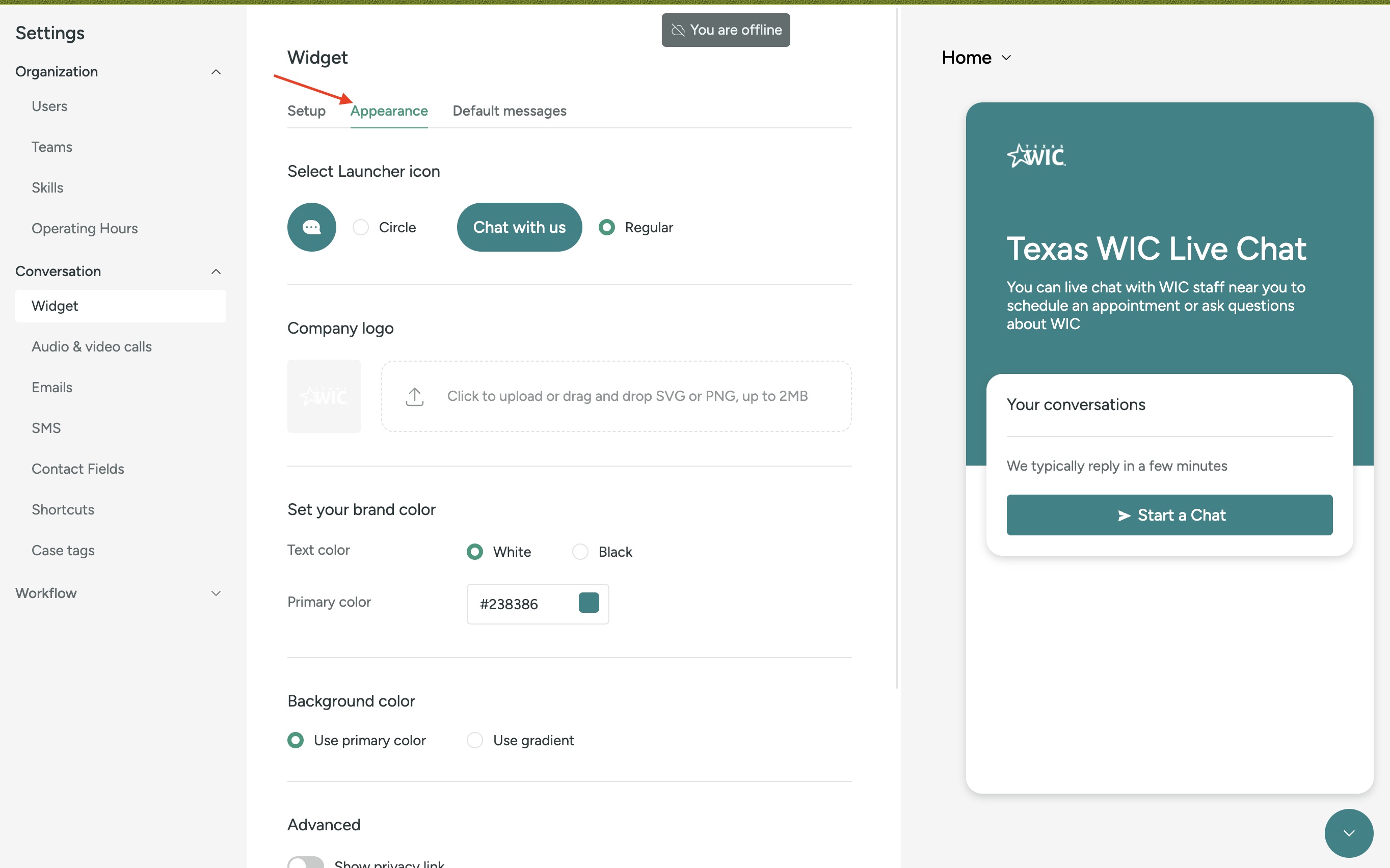
Turn your widget into a true reflection of your brand. Head to Settings > Conversation > Widget to get started.
In the Appearance tab, choose a launcher icon, primary color, text color, and widget position. Any changes will update in the Widget preview. Press Save to update on your site.

Selecting Launcher Appearance
Visitors access the widget through the launcher. Make your launcher as visible or discreet as you need it to be.
Regular
Let your visitor know you’re ready to chat with the "Chat with us" launcher icon.
Circle
Don’t have much space to spare? Use the more subtle, circle launcher.
Company logo
Choosing Colors
Create a branded look by customizing your widget’s color. Primary Color changes your launcher and widget’s background color. Color Scheme changes your launcher and widget’s text. Type in a Hex color code or select a color from the palette.
Tip: Use a dark Primary Color with white, or a light Primary Color with black, to make your messages pop!
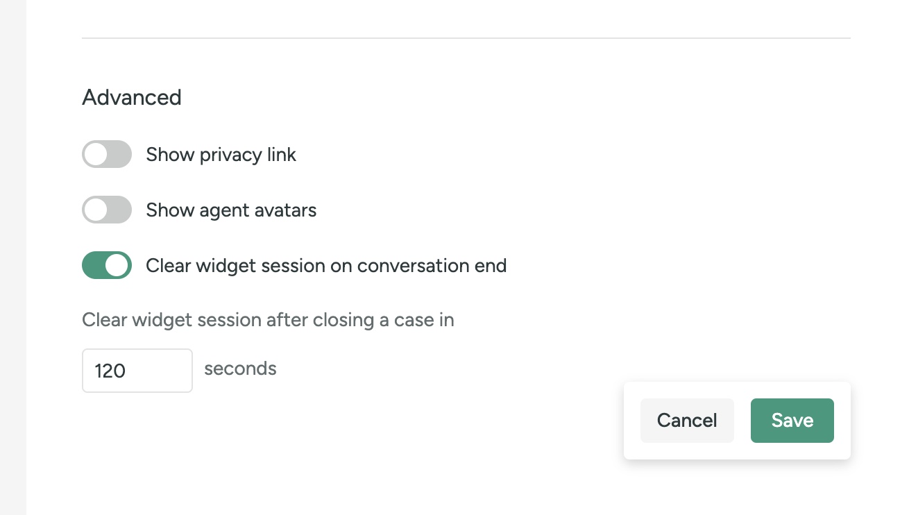
Advanced

Choosing Position ?
Choose the position that makes the most sense for your website. All widgets start at the bottom right (0,0).
Got lots of text images on one side of your site? Set your widget’s Alignment to the left or right as needed (measured in pixels).
You can also choose how far left or right with Side Spacing.
Move your widget up with Bottom Spacing.
Click Save when you’ve finished making any changes.
Was this article helpful?


